Showing posts with label Clear Scraps. Show all posts

Monday, 9 February 2015

Create; An Altered Artist Palette

It has been coming to about a year plus I've been seriously crafting, creating various DT projects and conducting classes... Gradually I've witnessed myself evolve in the way how I create... It was indeed a journey that had brought me this far and I learned alot, much more than what I could have learned in a design school... I'm still learning though and it's not the end; still searching for an identity that will mark me as an Artist/Designer...

So, finally an opportunity came... An opportunity that never occured to me that it will serve as a beginning to fulfill my dream as a designer... After 2 meetings with the prospective company, I'm finally offered a position with them... I'll be learning everything under the sun which will equip me with all knowledge and skills that I'll need in order to create my very own label in the future... Seems promising and of couse I'm elated... Holding my joy back a little, I try not to get too overly happy and idealistic... I had learned to be more practical and realistic... Dream don't just come true just like this and it requires a lot of time, effort and commitment... Getting into a job as such doesn't means it will nurture the creative aspect of my brain... Afterall, I still need to have an identity that's highly original which is what I'm always pursuing for...

I'm pretty known for my intricate details in most of my works and I pay attention to details and love to create innovative works that seems to be complex yet creating an illusion that look way too simple to achieve... I'm refining this creative aspect of mine in fact... When I decided to move into innovative teaching, I know it's one such challenge and risk I'll have to take - it's either you love or hate me... Students who had attended my classes regularly will understand the amount of effort I put in for all my class projects... And there's a reason why sometimes they will often label me as the most pervertic craft teacher on Earth... LOL!!

Well, for the very first day of this week, I'm sharing this altered artist palette that I had done previously as one of my DT works for Clear Scraps using Prima Printery collection and quite an amount of their flowers, gems and resins... It's a project that I'd like to showcase to mark my creative journey...

I shall catch up with you guys very soon... Happy Monday!!! Cheers!!!


Tuesday, 13 January 2015

Clear Scraps CHA Project Features

This year CHA seems to be a blast!!! Despite of my busy schedule last week, I only managed to catch a glimpse on what's happening via Facebook... Simply mind blowing on how amazing the products various manufacturers are coming up with... Seriously, I hope I could be there...

Well, a couple of my projects are there - mainly Graphic 45... Yeah!!! And I manage to see them via the publicity of my fellow design team members who took several pictures and posted them on Facebook... But not forgetting, I do send in my fair share of projects for Clear Scraps as well, showcasing around the booth...

Below here are 2 projects featuring the latest CHA releases; a mini mixable album and a wall decor using the clipboard and clear box... Total in love with the subtle colours of this paper collection, I used Pion's Vintage Garden for these projects... Also, used quite a number of I Am Roses mulberry flowers and laces from my stash... They just go so well together... Of course no forgetting some shabby chic resins and chipboards from Dusty Attic...


Monday, 12 January 2015

An Adore Fashion Adventure Mother Goose Layout

On today's Graphic 45 Blog Post, I'm sharing this cute little layout I've done using the Mother Goose collection...

Featuring my niece in her wild personality, she's simply a rockstar venturing into fashion... LOL! We were shopping one afternoon for her clothes, and before we could catch her, she was taking some accessories off the shelves to match her outfit... That's too adorable of her that we had to take a picture of her... And here she is, showing us this "Rocker" look... Fret not, she wasn't showing us the finger, she was just piping up 2 of her fingers trying to be a rockstar...

Just love her deep deep... Too cute...


Saturday, 3 January 2015

It Has Been a Busy Year...

Yes it's a New Year... Year 2015 is here... Just 3 days ago, it was just last year... I actually didn't feel the year was reaching an end and a new year has arrived... Partly is also 'cos I was super busy with Clear Scraps & Graphic 45 CHA projects, Prima class projects and my other various DT assignments... I was seriously that busy that I actually missed the countdown for Year 2015... I only got to shout "Happy New Year" to my younger sister at 12:05am and she gave me a look... A "huh" look... LOL!!

Finally when all are done, I manage to slow down and slack a bit before I kick start for this year's planning... It has been a pretty fruitful life changing 2014 year for me though there's some major life changing events taking place... Things started changing from the day I got myself into the Graphic 45 Design Team for 2014/15... And gradually I become part of Prima Educators, ScrapFX and Shimmerz DTs... It was definitely a busy year for me and when I got to realize it, the year of 2014 has reached an end...

Whether you are someone who just get to know me via various DTs I'm in (notably Graphic 45) and my various social media network (YouTube, Instagram, Facebook, etc), or those have been attending my classes in Singapore, some of you probably may think where is this lady coming from and what's her background?!? In particular from scrappers who had attended my classes at The Art Republic, you guys always wonder where the heck I find those technical inclined and interesting techniques to teach in class... 

Biggest question of all I always get is where do I get all my inspirations from and what's running in my mind?? Gradually, I'm labelled by most you as one of the most pervertic craft instructors on earth who loves to torture her students in class... LOL! I don't totally deny that but as always, you guys do love to be tortured by me... At the end of the day, you guys bring back home with a fulfilled mind other than the project itself isn't it? And it has been one of my most happiest accomplishment in craft teaching to see you guys practicing the techniques I taught and transform them into something different and share it with me... I suppose this is what education is all about... 

People who know me enough understand that I had previously received formal biomedical and scientific training and had been in the R&D and biomedical industries for years... My very first R&D job was with Johns Hopkins, under one wonderful inspirational boss, Dr. Natasha E. Zachara who taught me alot of things about glycobiology and scientific research... My very last job dealt with advance cutting edge technology and product development for early cancer detection, mainly in cancer management in terms of Personalized Medicine... Due the tremendous pressure to meet industrial demands yet keeping opportunity cost as low as possible and to push the most innovative product out while the iron is hot on a global basis, I decided call it a day and enter into a land where I want to be in before I could die from physical and emotional constipation...

Way before I received my formal biomedical and scientific training, I took up traditional and fine arts in school for a period of 10 years and had informal training in both graphic and web design... In January 2014, I won an inaugural national shoes design competition which awarded me a full scholarship to study footwear design with one of the renowned Italian school, Ars Sutoria... Being a designer in this aspect is never an easy process especially if you are looking at being real and orginal... As I embark my journey as a true designer, I was given advice by several veterans in the industry to search for an identity... And that's where I'm here entering into this world of scrapping and crafting!!! Re-learning what colours and design elements are all about...

Along the entire year of 2014, being in various teams taught me a lot of things, meet a lot of wonderful and inspirational crafters across the globe and definitely I can gradually see myself evolve... Still learning and improving... I'm very grateful and thankful for the various opportunities given in particular for my very pioneer LLS, The Art Republic whom had given me the pilot chance... I love exploring, thinking out of the box, putting my various life experiences in my works and sharing my inspirations across the globe... Though meeting project deadlines may be stressful especially in days when you lost your mojo, I actually enjoy these processes much more than what I had been doing previously...

So that's my little background story... I hope this hasn't been a boring entry... And now it's the exciting fun part, Graphic 45 is releasing 3 new collections for this CHA - Artisan Style, Home Sweet Home and Precious Memories... Sneak peaks up for next week!!! And... they are also re-releasing 2 previous collections; ABC Primer & Once Upon a Springtime... Simply gorgeous and to die for!!! If you're going for this year CHA, I've done up 5 projects for the booth... Be sure to pop by and see what my other fellow teammies have done as well...

Cheers!!!


Thursday, 18 December 2014

Christmassy Snow Clear Cards

Yeah I know... It's just next week, Christmas is just next Thursday... And for this crazy December, whooping up more Christmas projects and I realized I've made quite a number of cards for this season...

Today over at Clear Scraps' blogpost, I'm sharing these wintery Christmassy snowy clear cards using the Send it Clear cards and Prima's Epiphany paper collection and diecuts from the purple dies series... Love snow and the feel of winter so I've been playing with giltter this whole week!!! Can't get enough of it and my room is kinda gilttery from building the snowman to making the snow fleeces... Added a soft touch of gold to mellow down the general whitish feel of these cards so that whoever receive these cards can feel some warmth in this Christmas!!!


Here is the list of supplies used to make these cards:

Thursday, 11 December 2014

Time to Celebrate; A Birthday Pop-Up Card

Just a few weeks ago, someone posted a request in one of the local scrapping FB group I'm in, asking for volunteers to make some handmade cards for a Christmas and Birthday celebration for the old folks... The event was scheduled on the 13th December, which is this Saturday and it coincides with one of the grannies' birthday whose age is 98!!! Wow!!! She's having a long blissful life to live till that age... So I decided to volunteer to make a card for this birthday girl...

What really took me by surprise is the requirement of this card; it has to be A4 in size (8.27" x 11.69") when folded... It never occurred to me a card need to be that big to be given... Seriously, I was indeed taken aback... However, I got to know that the reason why the card needs to be that big - it has to be signed and penned down by the staffs and volunteers who organize this party... It must be a huge group I suppose...

Given the fact that I wasn't a true card-maker, making such a big card definitely puts me into challenging mode... For weeks, I couldn't possess the mojo in cardmaking, not to say in doing up such a big card... I sieved through my Graphic 45 Time to Celebrate collection for umpteen times till I finally have an idea what I want to do... I decided to do a pop-up... Completely a "steal" technique from YouTube and notably Martha Stewart's Mother's Day pop-up card, I re-created this card with added dimensions, together with the birthday girl's name on it... With all the excitement still hovering over my newly bought Big Shot plus I've received my dies (Yeah!!!), I attempted to die-cut on acrylic... And it works on the acrylic craft sheet that comes in my Clear Scraps DT package!!! It was a thrill to see patterns popping out when I passed the acrylic sheet through my Big Shot!!! Heehee... Can't help it but I just wanna find things to try on... 

Alright, I digress... So here I'm presenting this card for this 98 year old birthday girl... Hope she will like it... I hope this will give you an idea when it comes to making such a big card... Trust me, pop-up works amazingly well on big cards and I'm glad I made this choice for this card... 

Front of the card... As it's a pop-up, I'd have to add a ribbon to tie it down..
A close-up view on the embellishments...
The card that pops up with a bouquet of flowers...
The name of the birthday girl was added here...
The back of the card...

Here is a list of supplies that I used to make this card:

Monday, 1 December 2014

A Prima Epiphany Mixed Media Layout

Alright scrapping peeps, I know some of you've been waiting for this and it's my pleasure to present my first ever start-to-finish mixed media video. Now screening on my YouTube channel. Yeah!!!

In this pilot video, I'm sharing a time-lapsed progress in how I created this pearlescent Epiphany mixed media layout using Prima's Epiphany paper collection, Ingvild Bolme's Shabby Chic Treasures, Prima flowers, Colour Bloom Sprays and Finabair's ArtBasics, ArtExtravagance and ArtIngredients. Yes it's a layout that I used almost 90% of Prima goodies!!! Though the general look of this layout look simple, but the work behind is not what you think it is as you will get to see in my video. The Epiphany collection contains a good blend of pastel blue, pink and gray which will be the colour palette I worked towards in building this layout. Filming is not really easy for start-to-finish mixed media videos as I'll have to plan properly to ensure the flow is smooth. Certain tasks such as fussy cutting, planning and positioning of embellishments to waiting for medium to dry are not shown in order to make the video within 30 minutes for maximum pleasure and view ability. I was quite excited yet nervous for this as I was pretty concern that it may not turn out that well. Finally I survived!!!

I had developed this photo of mine and had kept it for quite a long time till I decided to create a layout using Prima's Epiphany collection. The white pureness with a touch of soft pastels of this collection just make my heart flutter. I really love this collection. Moreover I'm a Christian and Epiphany has a biblical meaning to it. Epiphany itself is a traditionally observed church festival held on 6th January to celebrate the manifestation of the divine nature of Christ as represented by Magi (Matthew 2:1-12). Hence, I decided to create a layout to kick start this holiday season (though it's not 6th January yet), to commemorate my status as a child of God and the essence of the Gospel and Christ. Also, as a form of remembrance and realisations I've gotten from God.

Alright, before I bored you guys any further, here I'm presenting this for your crafting inspirations. Feel free to let me know what you think and remember to comment and subscribe to my channel. More photos below and a list of supplies as follows.

Happy crafting!!! Cheers!!!


Here is a list of supplies I used for this layout:

Saturday, 15 November 2014

A Lovely Triptych; Sentimental Piece for my Niece

Today on Clear Scraps blog post, I'm sharing this lovely triptych featuring my niece and her newly married French husband... Using the sweet pastel colours of Graphic 45 Time to Celebrate paper collection, I created this really simple but yet enchanting triptych for her... Because the photo that's taken by her friend, Mattew Seah is really sweet and simple, I do not want to overly embellish it and just added a little damask texture to it... And of course not missing the fluttering butterflies...

This couple is really tall I should say and I'm glad that my niece has married a man whom she truly loves... I wish them happiness in their marriage and hope she will like this...

Here is the list of supplies I used to create this project:


Tuesday, 28 October 2014

A Roam Broom Halloween Layout

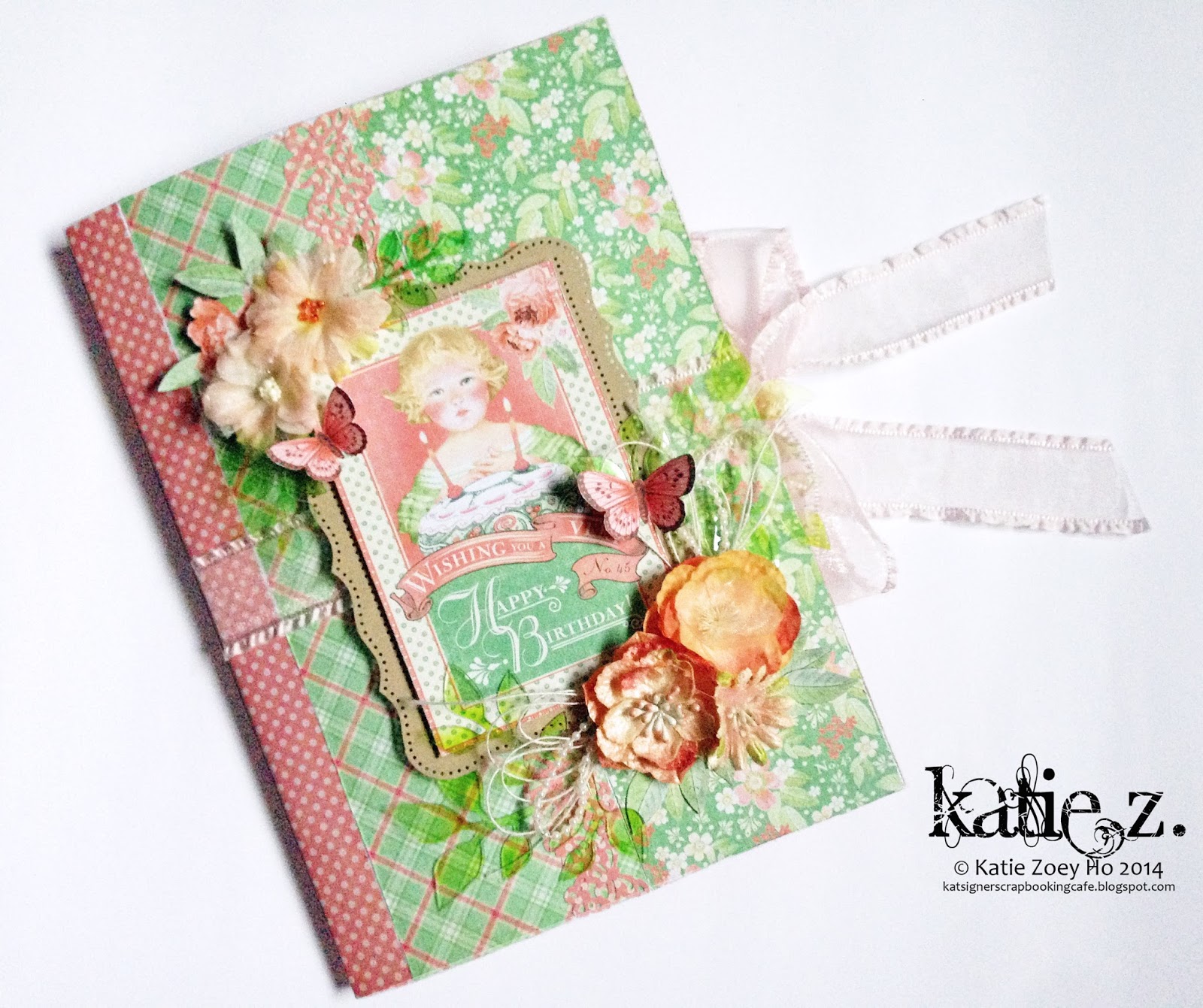
Today over at Clear Scraps Blog Post, I'm sharing this super cute layout using Graphic 45 retired Happy Hunting collection... Featuring my niece when she was about 2 years old, trying to be a housekeeper at home... She insisted to sweep the floor for us but she ended up getting the wrong broom and ended up getting herself stuck underneath her pants... Struggling to get herself out from the "broom", she gave this super duper cute expression that was so desperately funny... So out I came and took this epic moment of hers... Haha... Come to think about it, she was really too cute and funny...

I started off with a sheet of 12" x 12" acrylic sheet and centre down with a piece of  pattern paper... Did some minimal mixed media work here - random damask stenciling and some painting on the chipboard pieces... As I wanted this to be cute and simple, I kept this layout to the minimum... As usual in what I love to do, I gave my niece a witch hat and a tulle veil, turning her into a cute little witch for this Halloween...

Halloween is only this Friday, I hereby wish everyone a Happy Halloween!!! Have fun and happy crafting!!! Cheers!!!


Here is the list of supplies for this layout:


Friday, 10 October 2014

Sweetest Little Thing; a Colourful 3D Layout

My sister has recently given me a stack of photos she took randomly when my niece was still a baby... She gave me the liberty to scrap all if I want... After viewing through the photos, I found this very sweet photo she took when my niece was about 6 months old with her daddy... Her cuteness in this photo was sweetness to the MAX!!! She was such an eye candy...

The initial idea was to do up a colourful layout with falling flowers from the circles border... I actually kinda screwed up the mixed media part which ended up not getting the ideal results I'm looking for... At the end of the day, I decided to rectify the problem by adding more colours... till... I got a huge rainbow cloud beneath... While I was placing the elements, suddenly the thought of balloons came to my mind 'cos my niece loves balloons of all sort... And this eventually led me to get the inspiration from Disney Pixar's animation UP! So I thought it would be interesting to do up a 3D hot-air ballon under a rainbow cloud for her instead of using flowers since the father is in the picture which will make the layout kinda weird...

The 3D hot-air balloon is about 4" wide and 6" tall and it doesn't really look nice when it's at the centre, hence I decided to just let it goes off the page... Anyway I want this 3D so I don't really want to restrict to everything within the 12x12 page... Her dad's pink t-shirt certainly blends well into the entire colour scheme of this layout and at the end of the day I'm pretty happy with the results... Totally inspired from UP!

Here is the list of supplies used to create this layout:


Sunday, 5 October 2014

New Items Listed at my Etsy Store

After several thoughts I decided to list some of my projects on Etsy for sale, simply because I'm shifting back to my mum's place pretty soon and there's some space restriction. Plus I can't possibly bring everything over.

So instead of dumping them away, I think it'd be better to list them and sell them away to someone who will appreciate my works. Those who have been following me, you probably have seen some of them.

Some projects may not be practical but all of them are created with a lot of hardwork and I do spent great amount of time and effort in putting things together. Below are several projects I've made this year which I've listed for sales. Do pop by my shop and take a look.